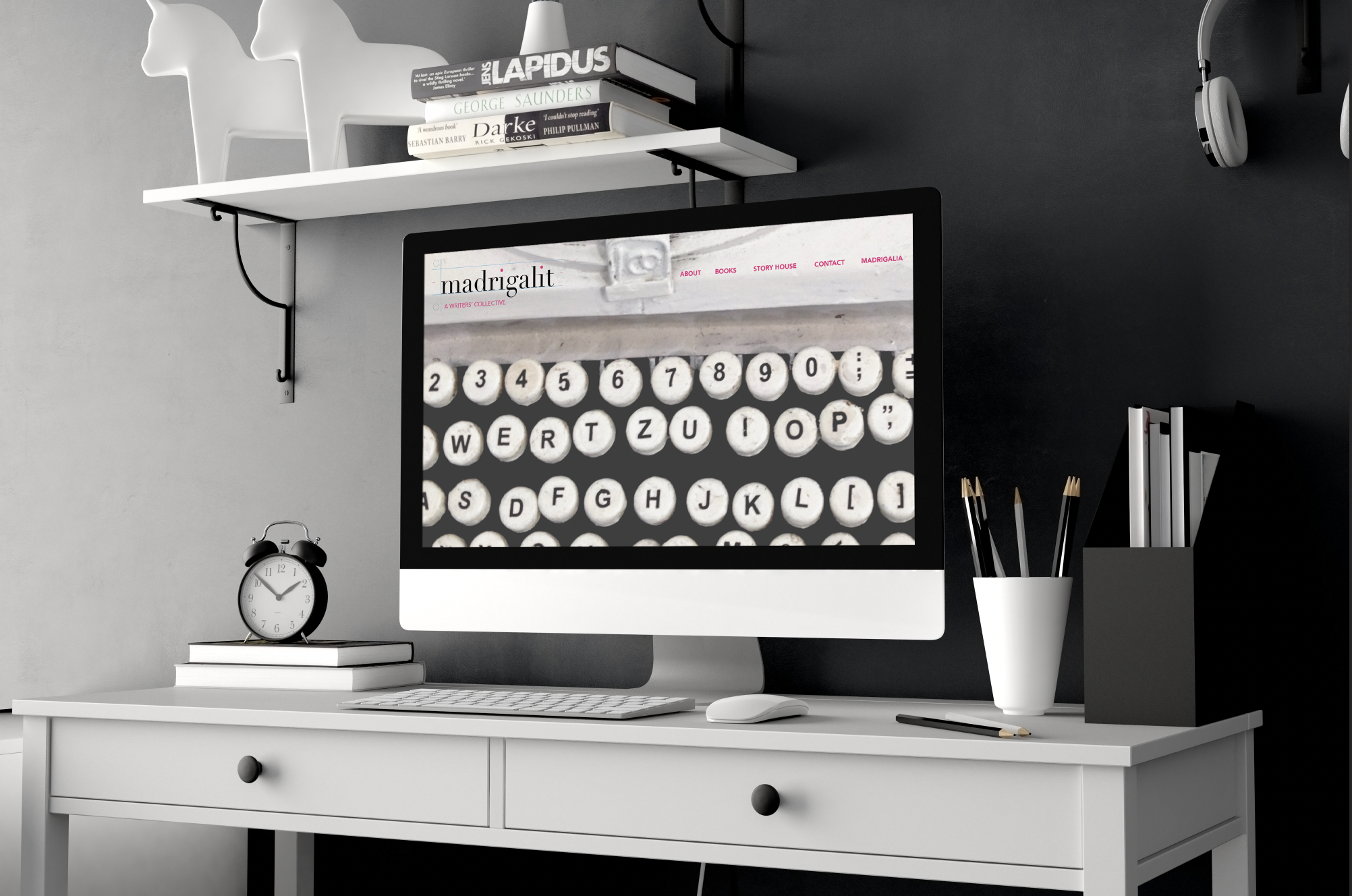
When two writers wanted to create a new collective together, they were looking for a branding scheme that immediately addressed the art of writing. Although both writers are incredibly tech-savvy women, using computers for almost all of their work, they wanted to invoke the history of writing into the look and feel of their company in order to create a sense of quality and trust for their clients—clients who might come to them to write about the arts, culture, food and wine, travel, and more. Given this desired direction, we developed a design that integrated parts of a notebook page, including pink and blue lines and punch holes, in the logotype, and incorporated a photograph of an old-fashioned typewriter in the accompanying imagery, such as a book cover, postcards, bookmarks, and web design. When we look at these designs, they certainly make us curious to discover more about these writers’ work—they even make us want to pick up our ink pens to start writing, too! You can discover more about their collective here.